#but not really @ staff
Explore tagged Tumblr posts
Text
here's your fucking feedback @staff
list of problems the removal of icons causes:
i cant see my friends
ruins the sense of community
can't tell at a glance who's online right now and what they're interested in
literally cannot tell without scrolling back up who put a post on my dash if it has a single addition attached to it. or like. 2 paragraphs in the op.
i cant click my own icon at the top of the dash to quickly view my own blog
can't tell who someone used to be if they change their username
squashes the margins between the menu and posts, making the whole dash feel more cramped
ruins the quick visual cue of how long each post is and where it ends when you're trying to scroll past ones youve seen before
people put a lot of creativity and individuality into icons, and now i never see them
makes people who primarily reblog instead of make their own posts all but completely disappear
list of problems solved by removing icons:
?????
who the fuck was asking for this
ive never in my life seen a website or app that has profile pics forcibly HIDE them, so i guess you did it you made the dash unique again in the worst way
here's some more feedback: maybe when you run an a/b test you should, idk, actually have a feedback form people can fill out about it somewhere
#tumblr#tumblr changes#tumblr updates#i hate this and honestly the difficulty in finding a place to give feedback#makes me really sympathize with the people who just cuss staff out all the time
65K notes
·
View notes
Text
"Go to hell" is basic. "Hope your favourite anime movie sequel gets cancelled after seven years in production AND getting an animated teaser." is smart. It's possible. It's terrifying. It's happened.
#I don't follow YOI#but seriously though I feel really bad for the fans#Mappa has such talented staff but management's work practices suuuuuck#those guys are probably being overworked on way too many projects and there's been too high a staff turnover to continue the film#like I'd be amazed if any of the original artists are still working on it#imagine working on it knowing now that your work won't see daylight and that none of the overtime or suffering was worth it#yuri on ice#ice adolescence#mappa studio
10K notes
·
View notes
Text
post itself
false flags
trans/adjacent tags
accessibility features
tumblr live post (thanks for the link, @problemnyatic)
flashing / strobing / lights
unblockable flashing ad
buying ad free
staff @/macmanx guilt trip
list of staff + more issues
#post nuked bc proshippers started insulting people who rbed this and implied partyjockers attempted to Kill staff? it was getting old so#archive links still under the cut if you want and you can rb this from others if you want the og#hint: if you dislike this post or want to debunk parts of it the way to go about it isn't to call people who've rbed it 'disgusting little#fuck ups' that are 'spreading anti shipper lies'#note: this post is and was Not about ship discourse jesus fucking christ proshippers get a grip#also ace discoursers are here too? this isn't about you either?#edit 2: if you send me an anon regarding this post about how im policing discussion or 'don't really want it'#but then stop replying when i answer your ask#maybe that's. not helping discussion?#i nuked this post as people started making up false accusations to smear people staff sniped. aka accusing someone of IRL ATTEMPTED MURDERS.
39K notes
·
View notes
Text
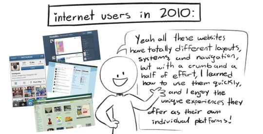
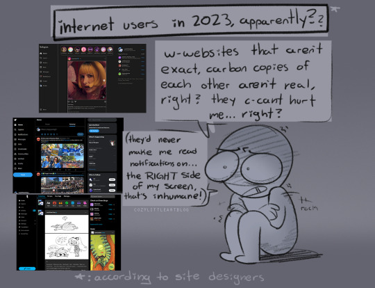
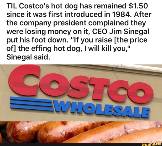
@staff if you [change] the [design] of the fucking [dashboard] i will kill you
edit. i want it on the actual post that i am not actually making a de-th threat against the staff. that's shitty. the caption quotes the fucking costco hot dog meme, which i originally said in the tags. if any staff member sees this please do Not take it personally
#dashboard#staff#tumblr update#comic#art#doodles#costco ceo about the price of a hot dog.png#i refuse to believe this is a real problem that site owners think people have#frankly i refuse to believe people had this issue with deviantart before eclipse#i am sorry you have to put about 15 minutes of effort into understanding a new website. feel better soon#my main blog doesn't have it yet but i logged into here to make this post and. i have it#this is fucking terrible. it would ahve been really really funny for april fools day but not as a permanent change#i hate it a Lot. i hate it so fucking much. oh . my god.#edit - guys i amnot actually sending de*th threats to staff it's the costco hot dog meme
28K notes
·
View notes
Note
c. can i ask what's happening with idia during the whole tsum thing
Idia gets into a fistfight with his tsum and loses

#art#twisted wonderland#twisted wonderland spoilers#tsumsted wonderland#i feel like i need some kind of signal to indicate when something is 100% actual canon with no exaggeration#because this really is just exactly what happens#idia gets physically bested by a beanbag and ends up on the floor wailing for ortho to save him#god i love tsumsted events#i was SO sad when there was no question mark after 'the end' this time :(#twst no we need staff tsums now#i need to see crowley versus a second smaller crowley#sigh. just one more week til we find out what happens at malleus' tsum party...
3K notes
·
View notes
Text
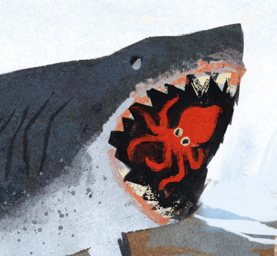
dream wip
#wip#artists on tumblr#flotsam diaries#arrhghhgg happy I got the textures I was aiming for#I was gonna go sleep but eve's song kororon really got me :'D#cough you can see the full image on uh instagram story if you don't wanna wait haha#technically this one's not a wip but wanna draw some others/make it a set#might tweak the octo though#anyways nOW I will sleep#muffled laugh#edit: oh!! thank for you radar tumblr staff :0#but also radar putting my post tag ramblings on bLAST LMAO
13K notes
·
View notes
Text
I really need to talk for a minute about this new mobile update and how much I as a legally blind person hate whatever the hell is going on with the photos and how it's making this app nearly impossible for me to use
I'm not sure the same thing is happening on the desktop version but for those who may not know in the app whenever you tap on a photo it used to just pop up and you could double tap to enlarge it and zoom in and scroll around and all was great.
A double tap now likes the photo and it must be pinched and pulled to zoom in and out. A mild annoyance, and nothing compared to the rest of the update. If you scroll up, which I do frequently when trying to navigate an enlarged photo, it will send you to ANOTHER photo based on the tags of the post.
That's right, a completely different photo!!! A feature no one asked for and no one wants!! This isn't facebook, or instagram, and maybe tiktok but I never had that so this is a guess. When I click on the photo I only want to see that photo (or in the case of multiple photos in a post I want to be able to easily scroll side to side for those). I do not want to be taken to another post!!! Also if you scroll too far to the left you are then sent to the profile of the person who reblogged the post. I do not know why. Who wants this feature? Is it a feature at all?
As someone who only taps on a photo because I cannot see it and I need to enlarge it, this is beyond a simple annoyance. I cannot navigate the photo like I need, there's a hair trigger on whether it sends you to a new post completely or if you are sent to the profile of the reblogger. Neither, again, are things I want. this leaves me having to back track a lot, re-zoom the photo as it reverts back to normal, and hope dearly that this time I can just read the damned text before it freaks out again.
I haven't seen anyone else talk about this outside of the tags, but really this is making the app unusable for me, and I'm sure for many others.
@staff I know you guys haven't cared about your disabled community much in the past (other photo updates that stopped allowing me to zoom into gifs is proof of that) but please don't make this app unusable for me. I would rather not have to leave.
#staff#tumblr update#tumblr#thanks tungle#I really hate it#please put it back#it's worse even that instagram or facebook because at least I can stop those from moving on and well#I feel like I singed up for that sort of thing with them
21K notes
·
View notes
Text

“i could be the light and pearl could be the darkness” - mythical j. sausage
#fanart#mcyt#pearlescentmoon#mcyt fanart#mcytblr#trafficblr#empiresblr#arena duo#mythicalsausage fanart#mythical sausage#mythicalmoon#mythicalsausage#pearlescentmoon fanart#pearlecentmoon fanart#friendly neighborhood spider pearl#spider pearl spider pearl#fantasy smp#mythicalmoon are scythe wealders#it makes me really happy#also as a side note#pearl is kayn#its canon#she uses the darkin staff that literally just grabbed the entirety of kayns game mechanics and puts it into mine raft#sorry im league player#karukaru art
2K notes
·
View notes
Text


Kate Bishop & Yelena Belova Vampire!AU
"She looked so pretty like the Devil."
#hawkeye#black widow#kate bishop#yelena belova#kate bishop x yelena belova#yelena belova x kate bishop#bishova#hailee steinfeld#florence pugh#sinners (2025)#vampire kate bishop#***#is it really an AU if your mother was murdered by your dad and then was resurrected as a half-vampire?#vampire hunter!yelena hunting down an evil vampire katie-kate???#it's family business after all#yelena relents and learns to compromise because i guess kate's Just eating boys (and drinking but not draining girls)#the way I'm too seated for sinners is terrifying the staff at the cinema#do NOT ask me how long it took me to colour match this on a colour inaccurate screen
1K notes
·
View notes
Text
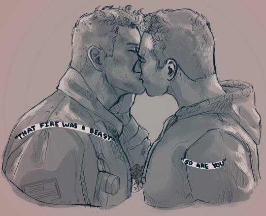
evan, you have a little something on your face :)
please do not use my art without permission!
#two art posts in one night???#i got the 911 brainrot bad gamers#ur really gonna call your boyfriend a beast in front of all that hospital staff#evan buckley you are so down bad for this man.#bi buck#911 fanart#bucktommy#bucktommy fanart#evan buckley#tommy kinard#digital drawing#digital art#spectrecowboy art#my art#kinley#tevan#firepilot#buck x tommy#did i reference both the screengrab and my recent ghostsoap art for this? yes. yes I did.#trying out a new brush size so there's that#911 spoilers#911 7x06#911 7x06 spoilers
2K notes
·
View notes
Text
wuthering heights retold as a series of airbnb reviews
#really awkward staff. rude host. ghost came through me window. stunning views though.#nice place. got mauled by a dog here but nice place. will stay again.#do NOT let them give you the attic room. refund!!!!!!!!#how the hell is this guy a superhost i am literally being held prisoner#0/5 stars very uncomfortable. couldn't rest. woke in torment tbh.
1K notes
·
View notes
Text

I got bored and spontaneously designed the thieves den trio, enjoy
#i really like the colors on these guys actually i wanna eat them#also not me changing all of thwir designs everytime i draw them lmaoo#i hope these ones will stay consistent i really like them#phighting!#phighting roblox#phighting art#shuriken phighting#vine staff phighting#slingshot phighting
414 notes
·
View notes
Text
Hope everyone had a good Christmas I got... Shingles.
#im fine im not even in real pain#but its very annoying that i cannot see a doctor to start antivirals today#and very funny that it shows up ON CHRISTMAS#like fr most places should be closed on major and a lot of 'minor' holidays#but i feel like the urgent care is one place that really needs to be open#and the staff should be properly compensated for working xmas#oh well guess i start them tomorrow.
2K notes
·
View notes
Text
woman,,,, (Phighting x Dungeon Meshi)


FALINSTAFF!!! RAAAAAAAAAAH
Yeah so! I’ve been getting INCREDIBLY into delicious in dungeon recently and I wanted something to show for it :3! Major MAJOR props to my friend @/pineconeius because these would not exist of these without them!
(extra little fun bits and such under the cut:)
Well, for added comments, both of these took an INSANE amount of time and effort, with the first one taking a whopping 18 HOURS and the second one taking around 11. I put a lot of love into both of these and man I am INCREDIBLY proud of how they came out, so hopefully yall like them as well :3
For some fun little facts on the first one actually, every last crosshatch and line-shadow was done BY HAND, I did not use a brush for it, I actually didn’t use any type of special brush at all (I used SCRICTLY the genius pen with the small exception of the background and the mid tones, which were made using a screen tone layer).


yup! All of that black stuff was drawn, by hand, with a single brush (help me)
this is also a small little less noticeable thing, I like how this panel came out a lot LMFAO

#Anyways tag time!#WOW#these took. A really long time#The first one took like 4 days of straight work and man I think it was worth it#Yeah I love woman a lot#art#artists on tumblr#phighting fanart#phighting#phighting roblox#roblox phighting#roblox#phighting art#digital art#phighting!#vine staff phighting#phighting vinestaff#vinestaff phighting#vinestaff phighting!#vine staff#phighting! roblox#phighting! art#phighting! oc#Phighting! Vinestaff#fan art#artwork#my art#illustration#drawings#art process
661 notes
·
View notes
Text
"i already told the boys im keeping this one [the cup belt]" wow what a shocker matthew i couldnt have forseen any of this happening at all


"i just put one on and i rarely taken it off since" yeah WE KNOW. pictures taken on 3 seperate days....its a problem
CBS News Miami | 6.28.24 (x)
#matthew tkachuk#florida panthers#more cup belt lore#icb the staff absolutely knew he would like this. put it in his stall. and he hasnt taken off since#love at first sight#so youre telling me the cup belt hes dragging around is his lmao#no wonder when a different cat has it its always specifically returned to him#re:cats in the club where you see luosty lundy and sasha play and raise the belt and then they return it back to matthew#his precious#emotional support cup belt#hes really a florida man im so proud oh my son oh my boy youve embraced this place#thats his dumb little cup belt and no one can take it away from him#its also like 550 dollars to buy so... yeah
516 notes
·
View notes
Text
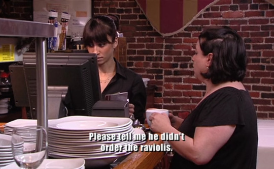
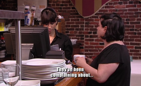

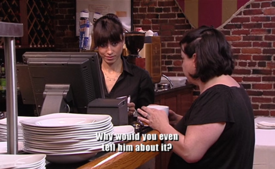

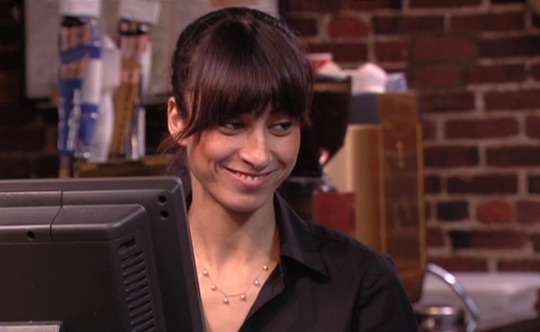
Kitchen Nightmares, S5 E1
#kitchen nightmares#kn lb#do i even have to explain why i dropped everything to capture this moment#you don't understand her smile makes me fucking insane#slowly unfurling like when the fucking grinch he realized he was gonna steal christmas#the staff on kn ARE NEVER FUCKING AROUND#especially when their bosses are shitty like. oh my god#it's the best part of this show hands down lol#love when the staff get tired of being nice#also im so glad i got that EXACT last frame it really really encapsulates the energy
6K notes
·
View notes